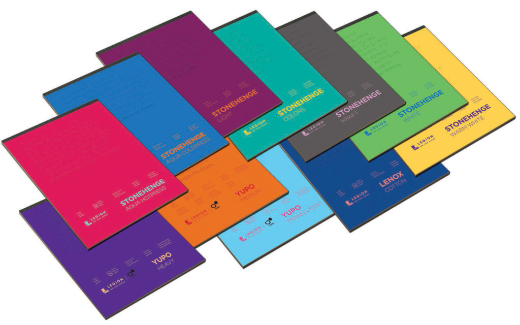
As true pioneers in the art of making paper, Legion not only innovates paper but its packaging as well. With this redesign Legion breaks from traditional cover styles as the new covers owe their elegance to simplicity. The covers literally tells creatives, both novices and professionals, what they need to know before choosing one of the papers. What does the paper feel like? What are its possibilities for all drawing techniques and watercolor? What will the results look like? With all essential qualities conveyed in words, graphic additions become superfluous. This enables Legion to choose a cover design that is simple, quiet and sleek. The array of subtle colors on all of the products serve as a common reference to the quality, refinement and exquisite know-how of Legion. Legion keeps on innovating. Their tag line? “We put vision into paper. We are paper.”
While it may look like a big change from outside, their identity and products remain the same. Their pad and block covers are merely highlighted. The new design is complete, the printing is in motion and the complete pads are set for exposure at MacPherson’s in early December.